Wedding Reception Decoration Ideas That Create Atmosphere
Key Points to Review
Wedding reception decoration (also called reception design, wedding styling, or venue decor) refers to the visual and atmospheric elements that transform a raw venue into a setting that feels intentional. Decoration doesn’t create atmosphere. The right combination of light, sound, and spatial flow does.
- Decor should change how the room feels, not just how it looks. Atmosphere beats accumulation.
- Lighting is the single biggest decor lever. A mediocre room with great lighting beats a beautiful room under fluorescents.
- Low centerpieces win. High centerpieces block sight lines and kill table conversation.
- Pick two decor priorities and spend on those. Cut the rest.
- Decor that photographs well and decor that feels good in person are often different things. Plan for the in-person experience first.
Most wedding reception decoration lists pile up every Pinterest trend into a single post. that’s how couples end up with a venue full of decor that photographs fine and feels cluttered in person. The ideas below are organized around what actually changes a room: lighting, florals, tablescapes, statement pieces, and texture. Pick two priorities. Run those hard. Skip the rest. For deeper decor references, see Martha Stewart’s reception ideas archive.
Reception Decoration vs. Venue Styling vs. Wedding Design: Are They the Same?
Mostly, yes, but with useful distinctions. “Reception decoration” refers to the physical items (florals, linens, signage, candles). “Venue styling” includes how those items are arranged to work with the space. “Wedding design” is the broader vision that informs all of it, including color palette, texture choices, and the overall guest experience. All three overlap. The most useful frame is this: decoration is what you buy; design is how you use it; styling is how it lands in the room. Budget for all three or you’ll have decorations that don’t add up to a coherent design.
Lighting Is the Decor Decision That Matters Most
A reception venue under overhead fluorescent light looks like a conference room, no matter how many flowers are in it. A reception venue with warm ambient lighting looks like a wedding, even if the flowers are modest. Pair it with strong reception entertainment and the room does the work itself. Lighting is the biggest atmospheric lever at any reception and the most underspent line item on most budgets.
The Lighting Stack That Works
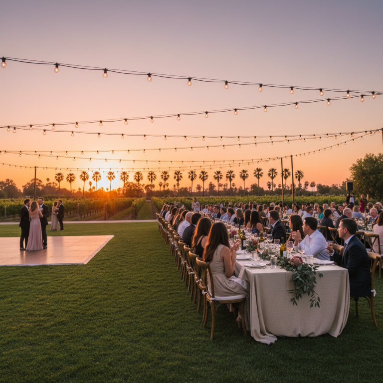
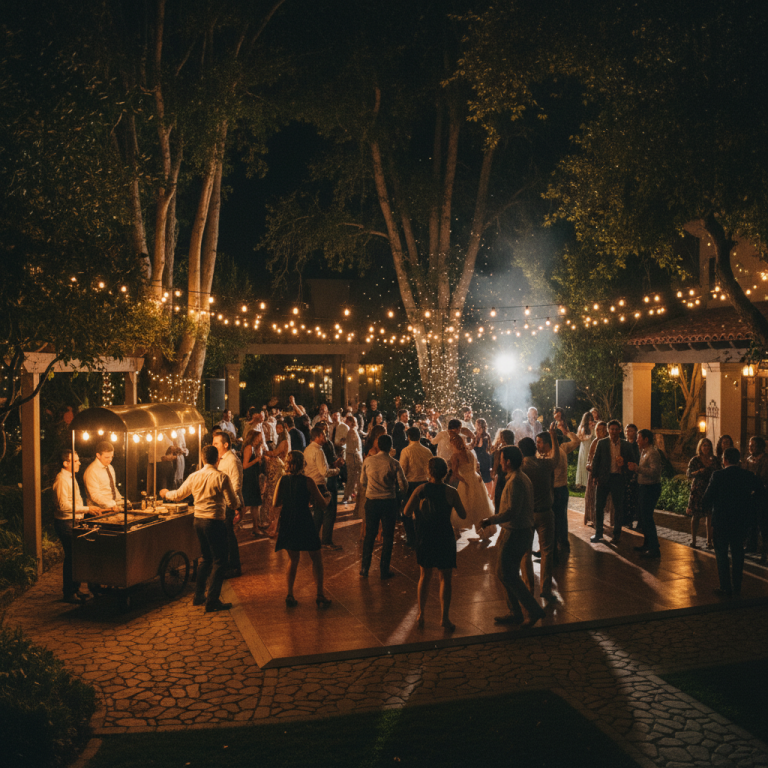
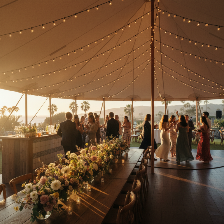
String lights or market lights overhead. The warm canopy. Works outdoor, works indoor, works at any venue. Should be the first lighting decision.
Uplights on the perimeter. Amber, soft pink, or warm white cast up onto walls. Turns a flat space into a layered one. Costs $300 to $800 for a typical venue.
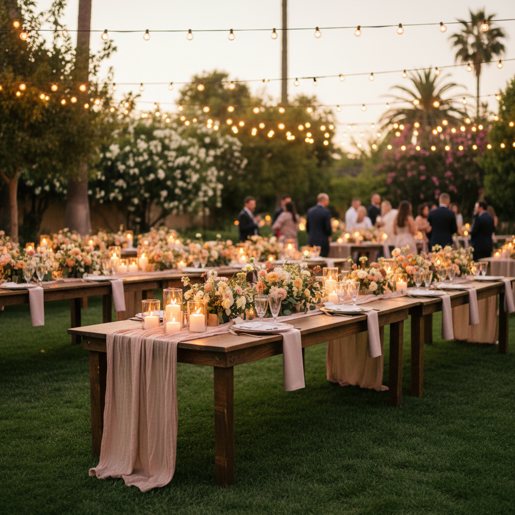
Candlelight on every table. Taper candles, pillar candles, or glass hurricanes. Flickering warm light at eye level. The single best low-cost decor upgrade.
Dance floor pin-spots. Focused light on the dance floor, dim everywhere else. Makes the dance floor feel like the stage it actually is. For more on layout and setup, see our dance floor ideas guide.
Overhead sparkle or neon statement (optional). A disco ball, a custom neon sign, or a hanging floral installation. Used sparingly, this is the signature decor moment. Used on every surface, it’s clutter.
Florals: Go Big in One Place, Low Everywhere Else
The all-over floral approach (elaborate arrangements on every table, every arch, every chair) burns budget and produces diminishing returns. The better approach: pick one statement installation and keep every table simple.
Statement Floral Options
A hanging installation over the sweetheart table. A floral arch behind the head table. A floral runner down the main farm table. A dramatic arrangement at the bar. Pick one. Spend on it. Photographs pull from that one piece.
Table Florals That Don’t Block Conversation
Low, wide centerpieces at eye level or below. Wildflower arrangements in clear bud vases clustered down the center. Single-bloom vessels in a line. Loose greenery runners with candles woven through. The test: if guests seated across the table can’t see each other, the centerpiece is too tall.
Tablescapes That Feel Considered, Not Cluttered
A great tablescape has three layers: linen, place setting, and centerpiece. Each layer should pull its weight without crowding the other two.
Linen. Textured linens (slub, linen-blend, or open-weave) beat polyester every time. Warm neutrals, dusty tones, or clean white. Avoid shiny satin.
Place settings. Charger plate, napkin folded simply, and a menu card or place card. Skip the overstacked napkin rings, confetti, and two different favors. Less visible layer means more room for the florals and candles to work.
Name cards or seating. Handwritten name cards if the budget allows. Printed is fine. Elaborate calligraphy on every card is a line item that guests notice for two seconds and recycle the next day.
Decor That Works Specifically for SoCal Receptions
Outdoor venues and garden weddings have natural advantages. Lean into them. We also have a dedicated outdoor wedding reception guide for SoCal venues.
Market lights strung across the lawn or tent. Warm, ambient, SoCal-specific. Never goes out of style.
Linen drapery on a tented reception. Softens the ceiling, reduces acoustic harshness, adds texture. Cost scales with tent size.
Lanterns and candles along pathways. Guides guests from ceremony to reception and makes the walk feel cinematic.
Fire pits or bonfires for coastal venues. Guests gather there after 10pm. Doubles as decor and a late-night activity.
Wildflower and eucalyptus greenery. Local, in-season, and looks intentional in a SoCal setting.
Decor That Underperforms
These show up on every list and rarely earn their place.
Chair covers. Outdated, cost $5 to $15 per chair, and most venues have chairs that look fine without them.
Charger plates with heavy metallic finishes. Catches light badly, looks dated in photos five years later.
Giant cardboard letters. LOVE, MR and MRS, and similar. Reads as prop, not decor.
Elaborate guest book tables. A table with a book, a pen, a frame, a fake flower, and a tiny chalkboard sign. Guests walk by it. The book ends up half-signed.
Scattered loose flower petals on every table. Looks messy by dessert. The servers hate them.
Over-signed chalkboards. “Today we celebrate,” “Love is patient, love is kind,” “Please find your seat.” Three chalkboards per venue is already two too many.
Signage That Earns Its Place
Some signs do real work. Welcome sign at the entrance. Seating chart (mirror, acrylic, or framed print). Bar menu. Reserved-table markers. Cocktail menu for a drink cart. These each have a functional job. Every other sign is decor for its own sake and is usually skippable.
Texture Over Ornamentation
The decor trend that consistently looks current in photos five years later is texture, not ornamentation. Linen over satin. Ceramic over plastic. Wood over laminate. Wildflowers over color-dyed roses. Real candles over LED. These choices don’t read as decor at all, which is why they photograph well and don’t age.
Budget Priorities If You Have to Cut
If the decor budget gets tight, cut in this order: favors first, elaborate signage second, extra florals on the cocktail hour bar third, lighting never. Keep lighting, keep the statement floral piece, keep the table candles, keep the textured linens. Cut the rest before cutting any of those four.
FAQs
What’s the most important decoration for a wedding reception?
The most important decoration for a wedding reception is lighting. Specifically, warm ambient lighting: string lights overhead, uplights on perimeter walls, and candles at eye level on every table. A room with great lighting and modest florals will feel more beautiful than a room with elaborate florals under bad overhead light. Spend the lighting budget first, then allocate the rest.
How do you decorate a wedding reception on a budget?
Decorate a wedding reception on a budget by doubling down on lighting and candles, keeping florals simple (low centerpieces with in-season wildflowers and greenery), and cutting everything that’s decor for decor’s sake. Rent candles and uplights instead of buying. Use the venue’s existing features (brick walls, wood beams, garden greenery) as decor instead of covering them. Skip chair covers, favors, and elaborate signage.
What wedding reception decor is outdated?
Wedding reception decor that’s outdated: chair covers with sashes, oversized cardboard letters, elaborate dyed-petal runners, satin linen overlays, metallic charger plates with heavy filigree, and any installation that reads as a prop. The decor that stays current is textured, low-profile, and naturally lit. Wildflowers, linen runners, candles, and warm lighting age well. Trend-driven ornaments don’t.
How tall should wedding centerpieces be?
Wedding centerpieces should be either below 12 inches or above 24 inches. Anything in the 12 to 24 inch range blocks sight lines across the table and kills conversation. Low centerpieces (under 12 inches) keep the table social. Tall centerpieces (over 24 inches on a raised vessel) sit above the eye line and don’t block anyone. Mix both at different tables if you want variety.
What decor photographs the best at a reception?
The decor that photographs best at a reception is the decor with visible warm light in it: candles on tables, string lights overhead, uplit walls, and a statement floral piece with ambient light on it. Photographers can work with almost any palette, but they can’t save a reception lit by overhead fluorescents. If a decor choice doesn’t have its own warm light source nearby, it’s going to look flat in the photos.
Is reception decoration the same as wedding styling or venue design?
They refer to overlapping but distinct things. Reception decoration is the specific physical items (florals, candles, linens, signs). Wedding styling is how those items are arranged to work together visually. Venue design (or wedding design) is the broader vision, including color palette, texture hierarchy, and the overall guest experience. You need all three to end up with a space that feels intentional rather than just decorated.